The shared Starlight theme for Nebari documentation sites. Add one plugin and every pack's docs get the same Nebari identity - brand colors, fonts, logo, and footer - so maintainers write Markdown and the theme handles presentation.
| Light | Dark |
|---|---|
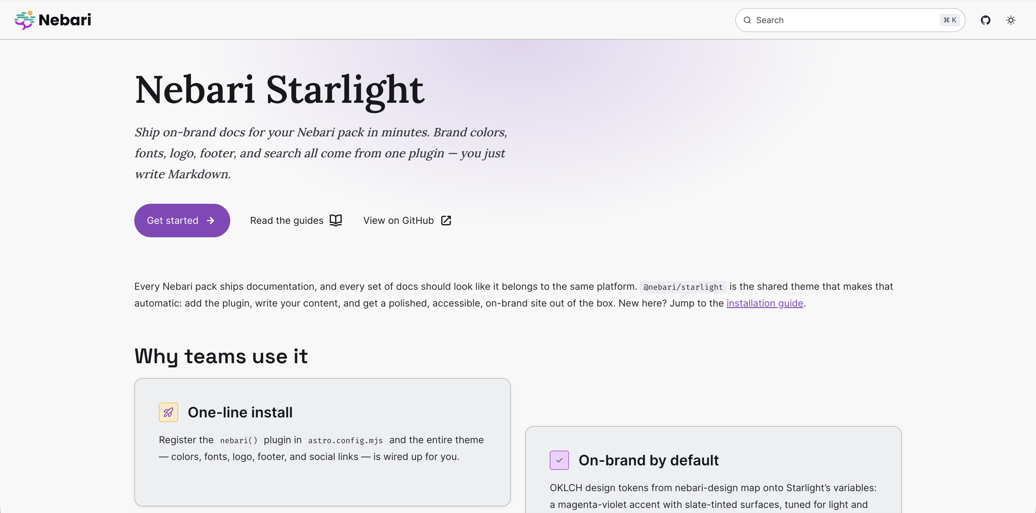 |
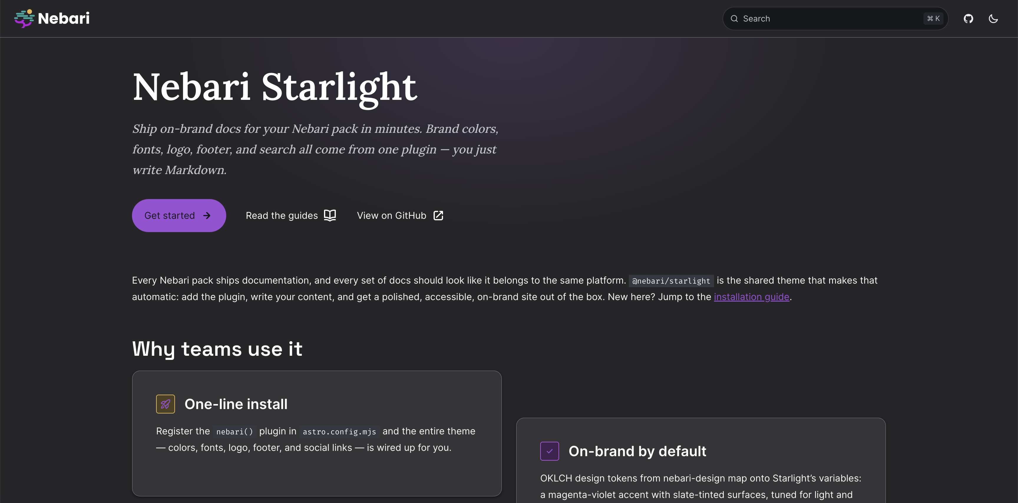 |
bun add @nebari/starlightastro (>=5) and @astrojs/starlight (>=0.33) are peer dependencies - install
them if your project does not already have them.
Add nebari() to your Starlight plugins:
// astro.config.mjs
import { defineConfig } from 'astro/config';
import starlight from '@astrojs/starlight';
import { nebari } from '@nebari/starlight';

export default defineConfig({
  integrations: [
    starlight({
      title: 'My Pack',
      plugins: [nebari()],
      // ...your sidebar, etc.
    }),
  ],
});
That's it - the plugin wires in the theme CSS, self-hosted fonts, the branded
SiteTitle/Head/Footer components, and a default GitHub social link.
Packs on the Nebari portal are served at packs.nebari.dev/<slug>/ behind a
Cloudflare Worker. Set Astro's base so links and assets resolve there:
export default defineConfig({
  base: '/my-pack/',
  integrations: [starlight({ title: 'My Pack', plugins: [nebari()] })],
});By default the header logo links to the site's own base. On the Nebari portal, point it at the portal root so it returns users to the pack catalog:
starlight({ plugins: [nebari({ logoHref: 'https://packs.nebari.dev/' })] })- Brand colors - nebari-design's OKLCH tokens mapped onto Starlight's theme variables in both light and dark mode. Starlight's WCAG-tuned gray scale is kept for accessible body and muted text.
- Typography - Poppins for headings, Atkinson Hyperlegible for body, Fira Code for code, all self-hosted (no external font requests at runtime).
- Logo, favicon, and footer - the Nebari mark in the header, an inlined symbol favicon, and a branded footer on every page.
- Search - Starlight's built-in Pagefind, ready to merge additional pack indexes for portal-wide multisite search.
Everything is overridable: your own customCss, components, and social
entries are merged after the theme's, so a consumer always wins.
This repo is a Bun workspace monorepo: the @nebari/starlight
theme lives in packages/starlight, and docs/ is an example Starlight site
that consumes it for previewing changes.
The example docs are deployed to GitHub Pages on every push to main and can be
viewed at https://nebari-dev.github.io/starlight/.
Install dependencies for every workspace from the repo root:
bun installPreview the theme against the docs site with hot reload:
bun run devBuild the theme package (compiles src/ to dist/ with tsup):
bun run buildRun the test suite (builds the package and docs, then runs the tests):
bun testBiome handles both formatting and linting (including
import sorting) from a single biome.json at the repo root:
bun run check        # lint + format check, no writes
bun run check:fix    # lint + format and apply safe fixes
bun run lint         # lint only
bun run lint:fix     # lint and apply safe fixes
bun run format       # format check only, no writes
bun run format:fix   # format and write changes in place
bun run ci           # biome ci — what CI runs
CI runs bun run ci (biome ci) and fails the build on any violation, so run
bun run check before pushing.
For editor integration, install the Biome VS Code extension and set it as the default formatter with format-on-save:
Color tokens are vendored from nebari-design's registry/nebari/globals.css
(namespaced to --nbr-*) so the theme needs no build step or network fetch at
runtime. Refresh them when the design system changes:
bun run sync-tokensThis package follows EffVer
(vMACRO.MESO.MICRO). Pin to a macro line so a presentation change cannot break
your build unexpectedly:
{ "dependencies": { "@nebari/starlight": "^0.1.0" } }Releases are published to npm automatically from GitHub Releases via
Trusted Publishing (OIDC, no npm
token), with signed provenance attestations. The .github/workflows/release.yml
workflow runs on every published release.
To cut a release:
- Bump the
versioninpackages/starlight/package.json(following EffVer) and merge it tomain. - Create a GitHub Release with a tag that matches the new version, prefixed
with
v— e.g. version0.2.0→ tagv0.2.0. The workflow verifies the tag matchespackages/starlight/package.jsonand fails the publish if they diverge. - Publishing the release triggers the workflow, which installs dependencies,
builds the package via the
prepublishOnlyhook, and runsnpm publishfrompackages/starlight.