




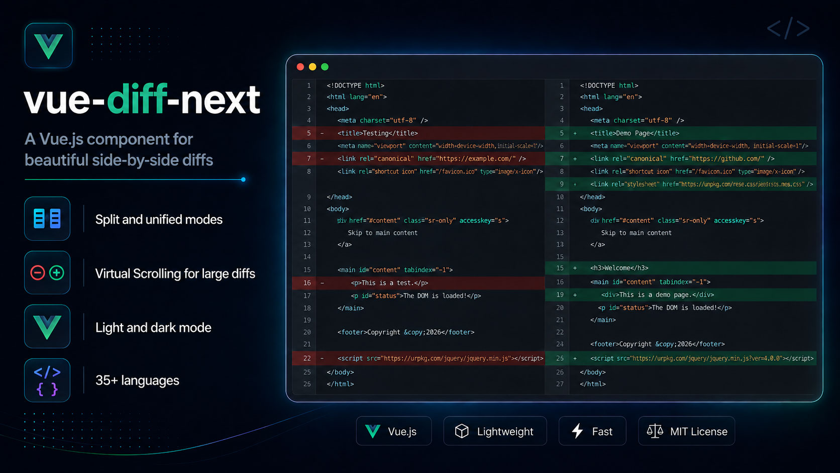
A lightweight diff viewer component for Vue 3.5+. Inspired by
vue-diff, which was archived in February 2025.
Same props, same modes, same look. ~18 kB gzip for the default bundle (style.css + component JS) with 30 languages bundled, versus roughly 75 kB for the original covering 7.
Try the Live Demo to see it in action.
- Drop-in replacement — every
vue-diffprop and default is preserved, verified against the original's own output - 30 languages, all bundled; no per-language imports or registration
- Split and unified modes, with word-level highlighting composed on top of syntax highlighting
npm install vue-diff-nextVue 3.5 or newer is a peer dependency.
As a component:
<script setup>
import { Diff } from 'vue-diff-next';
import 'vue-diff-next/style.css';
</script>

<template>
  <Diff mode="split" theme="dark" language="javascript" :prev="before" :current="after" />
</template>
Or registered globally as a plugin:
import { createApp } from 'vue';
import VueDiff from 'vue-diff-next';
import 'vue-diff-next/style.css';

createApp(App).use(VueDiff).mount('#app');
// Renders as <Diff>, or pass { componentName: 'VueDiff' } to rename it.
The stylesheet is not optional — the component ships unstyled without it.
| Prop | Type | Default | Description |
|---|---|---|---|
mode |
'split' | 'unified' |
'split' |
Side-by-side or interleaved. |
theme |
'dark' | 'light' | custom* | ... |
'dark' |
See Theming. |
language |
string |
'plaintext' |
See Languages. |
prev |
string | null |
'' |
The "before" text. |
current |
string | null |
'' |
The "after" text. |
showLineNumbers |
boolean |
true |
Diff line-number gutter. Set false to hide it. |
folding |
boolean |
false |
Collapse long runs of unchanged lines. See Folding. |
foldMarker |
'dots' | 'hunk' |
'dots' |
How a collapsed run is marked. See Folding. |
inputDelay |
number |
0 |
Debounce re-rendering, in ms. Useful for editor-driven input. |
virtualScroll |
boolean | { height, lineMinHeight, delay } |
false |
Render only the rows near the viewport. See Large diffs. |
wrap |
boolean |
true |
Soft-wrap long lines. Set false to scroll horizontally instead. |
Change the import and the stylesheet path:
- import VueDiff from 'vue-diff';
- import 'vue-diff/dist/index.css';
+ import VueDiff from 'vue-diff-next';
+ import 'vue-diff-next/style.css';
That is the whole migration. Props, defaults, modes, and both install paths are unchanged.
A few things to know:
theme="custom*"still works, but the CSS custom properties you override are named differently. See Theming.theme="light"/"dark"are a different palette than vue-diff's highlight.jsvs/monokai. For those colors usevisual-studio-light/monokai-darkand import the matching extra stylesheet (see Theming).- Language names still work, and more are accepted.
javascript,plaintext,markdown, andtypescriptall resolve as before. virtualScrollbehaves as it did, windowing the output to what is near the viewport. See Large diffs.
Same behaviour, different internals:
diff(jsdiff) instead ofdiff-match-patchfor line and word diffing.@speed-highlight/coreinstead ofhighlight.js. The reduced library size is mostly the highlighter:highlight.js's engine alone is 22.4 kB gzip, while@speed-highlight/core's engine plus all bundled grammars is about 9 kB.- No
@vueuse/core. Its debounce was the only part used; that is now a few lines. - Word-diff and syntax highlighting are composed at the token level. The original injected
<vue-diff-modified>marker strings into the source before highlighting and string-replaced them afterwards, which breaks if the content contains the marker. Here the two overlapping classifications are merged by splitting the token stream at word boundaries, so no string injection happens and content cannot impersonate a marker. - Highlighting is synchronous. Grammars ship in the bundle, so each visible row tokenizes in the same tick as the source change.
With folding, runs of unchanged lines collapse to a single marker row, so a small change in a
large file doesn't bury the diff. foldMarker chooses how that row looks:
<Diff :folding="true" fold-marker="hunk" :prev="before" :current="after" />dots (default) — a centred •••••, matching the original:
  12  const config = {
   >  • • • • •
  47    timeout: 5000,
hunk — a unified-diff header, stating how much was skipped rather than only that
something was:
  12  const config = {
   >  @@ -13,34 +13,34 @@
  47    timeout: 5000,
Both are styleable — see --vue-diff-fold-* under Theming. The dots' size and
spacing are variables, so you can tune them without overriding the content.
A changed line is never hidden by folding, and the first unchanged line after each change stays visible as context.
Pass any of these to language. Aliases in the right column resolve to the same grammar, so
highlight.js names and file extensions both work:
| Group | Languages | Also accepted |
|---|---|---|
| Web | html css js ts json xml |
htm vue · scss sass less · javascript jsx mjs cjs · typescript tsx · svg · jsdoc |
| Systems | c rs go java py pl lua asm bf |
cpp c++ h cs · rust · golang · python py3 · perl · assembly · brainfuck |
| Data & config | yaml toml ini csv sql md leanpub-md |
yml · conf cfg · markdown |
| Shell & ops | bash docker make git diff http uri log |
sh zsh shell · dockerfile · makefile · patch · url |
| Other | regex todo plain |
plaintext text |
Matching is case-insensitive and surrounding whitespace is ignored.
An unknown language renders as plain text rather than throwing, so user-supplied language names are safe to pass straight through.
theme |
Palette | Stylesheet |
|---|---|---|
dark (default) |
VS Code-ish dark | vue-diff-next/style.css |
light |
VS Code-ish light | vue-diff-next/style.css |
atom-dark |
Atom One Dark | vue-diff-next/themes/atom-dark.css |
atom-light |
Atom One Light | vue-diff-next/themes/atom-light.css |
coral-dark |
Coral keywords, teal strings | vue-diff-next/themes/coral-dark.css |
coral-light |
Same tokens, darkened for a white canvas | vue-diff-next/themes/coral-light.css |
github-dark |
GitHub Dark | vue-diff-next/themes/github-dark.css |
github-light |
GitHub Light | vue-diff-next/themes/github-light.css |
monokai-dark |
highlight.js monokai (vue-diff dark) |
vue-diff-next/themes/monokai-dark.css |
twilight-dark |
highlight.js base16-twilight | vue-diff-next/themes/twilight-dark.css |
visual-studio-dark |
highlight.js vs2015 | vue-diff-next/themes/visual-studio-dark.css |
visual-studio-light |
highlight.js vs (vue-diff light) |
vue-diff-next/themes/visual-studio-light.css |
custom* |
Unstyled; you supply the CSS | none |
dark and light ship in the default stylesheet. Extra palettes are a second import —
the wrapper class is always applied; without the extra CSS they look like an unstyled
custom* theme:
import 'vue-diff-next/style.css';
import 'vue-diff-next/themes/visual-studio-light.css';<Diff theme="visual-studio-light" ... />If you bind theme dynamically, import every extra file you might select.
Everything is driven by CSS custom properties, so you can override any part without forking the stylesheet:
.vue-diff-theme-dark {
  --vue-diff-added-bg: #143d2b;
  --vue-diff-removed-bg: #45161a;
  --vue-diff-syn-kwd: #ff7b72;
}
For a wholly separate theme, pass any theme value beginning with custom. The component
adds vue-diff-theme-<value> to its wrapper and ships no styles for it — you supply them:
<Diff theme="custom-solarized" ... />.vue-diff-theme-custom-solarized {
--vue-diff-bg: #002b36;
--vue-diff-fg: #839496;
/* …and the rest */
}Available properties: --vue-diff-{bg,fg,font-family,font-size,line-height,gutter-width},
--vue-diff-{gutter-bg,gutter-fg},
--vue-diff-{added,removed,disabled}-bg,
--vue-diff-{added,removed}-gutter-bg,
--vue-diff-{added,removed}-word-bg,
--vue-diff-fold-{bg,fg}, --vue-diff-fold-dot-{size,spacing,opacity}, --vue-diff-fold-hunk-opacity, and
--vue-diff-syn-{kwd,str,num,bool,cmnt,func,class,var,type,oper,section,insert,deleted,err}.
A few thousand rows lay out and paint slowly — the cost is DOM size and per-line highlighting, not diffing. Each visible row tokenizes in the same tick; without windowing, a large file means thousands of DOM nodes and thousands of highlight passes.
Use virtualScroll for large diffs. It renders only the rows near the
viewport:
<Diff :virtual-scroll="true" :prev="before" :current="after" /><!-- or tune it -->
<Diff
:virtual-scroll="{ height: 500, lineMinHeight: 24, delay: 100 }"
:prev="before"
:current="after"
/>| Option | Default | Meaning |
|---|---|---|
height |
500 |
Viewer height in px. Also sets the windowing extent. |
lineMinHeight |
24 |
Assumed row height until one is measured. |
delay |
100 |
Scroll throttle in ms. |
The window extends 1.5 viewport heights past each edge, so ordinary scrolling does not outrun it. Row heights are measured rather than assumed — a wrapped line can be any height — so the container's scroll height converges on the truth as rows report in, and the scrollbar reflects the whole diff rather than only what is rendered.
Measured on a 2000-line diff in a 500px viewer: 53 rows in the DOM instead of 2000, with a 48,000px scroll range. Only those visible rows are highlighted.
The component renders untrusted text as HTML, so escaping is a correctness requirement rather
than a detail. All text is escaped before insertion, and the escaping boundary is a single
small module with its own test suite covering <script> tags, inline event handlers, and
attribute-breaking quotes.
Found a hole? Please report it privately — see SECURITY.md.