Native theme accents: runtime var() bindings via addThemeProps#4884
Native theme accents: runtime var() bindings via addThemeProps#4884shai-almog wants to merge 4 commits intomasterfrom
Conversation
…ntime

CSS rules in the iOS Modern and Android Material 3 native themes
reference an accent palette via var(--accent-color, fallback). The
Flute compiler still inlines the fallback as the baked-in default
AND additionally emits a @cn1-bind:<UIID>.<key>=accent-color
constant alongside, so the .res file remembers which style keys
track which palette variable.

UIManager.buildTheme() gains an applyThemeBindings() pass that
overlays @<varname> overrides supplied via addThemeProps onto every
bound theme key. A user app rebrands the accent with a single
addThemeProps({"@accent-color": "ff2d95", ...}) call - no per-UIID
rule duplication, no theme recompile.

Replaces the compile-time-only var() approach reverted in #4877
(PR #4848). The same accent vocabulary works at runtime now and
the docs no longer suggest forking the shipped native theme.

Co-Authored-By: Claude Opus 4.7 (1M context) <noreply@anthropic.com>
|
Developer Guide build artifacts are available for download from this workflow run:
Developer Guide quality checks:
Unused image preview:
|
Cloudflare Preview
|
✅ Continuous Quality ReportTest & Coverage
Static Analysis
Generated automatically by the PR CI workflow. |
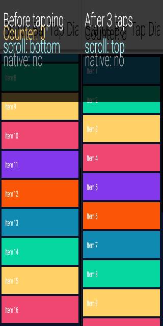
Android screenshot updatesCompared 90 screenshots: 85 matched, 5 updated.
Native Android coverage
Benchmark ResultsDetailed Performance Metrics
|
|
Compared 85 screenshots: 85 matched. Benchmark Results
Build and Run Timing
Detailed Performance Metrics
|
iOS screenshot updatesCompared 90 screenshots: 88 matched, 2 updated.
Benchmark Results
Build and Run Timing
Detailed Performance Metrics
|
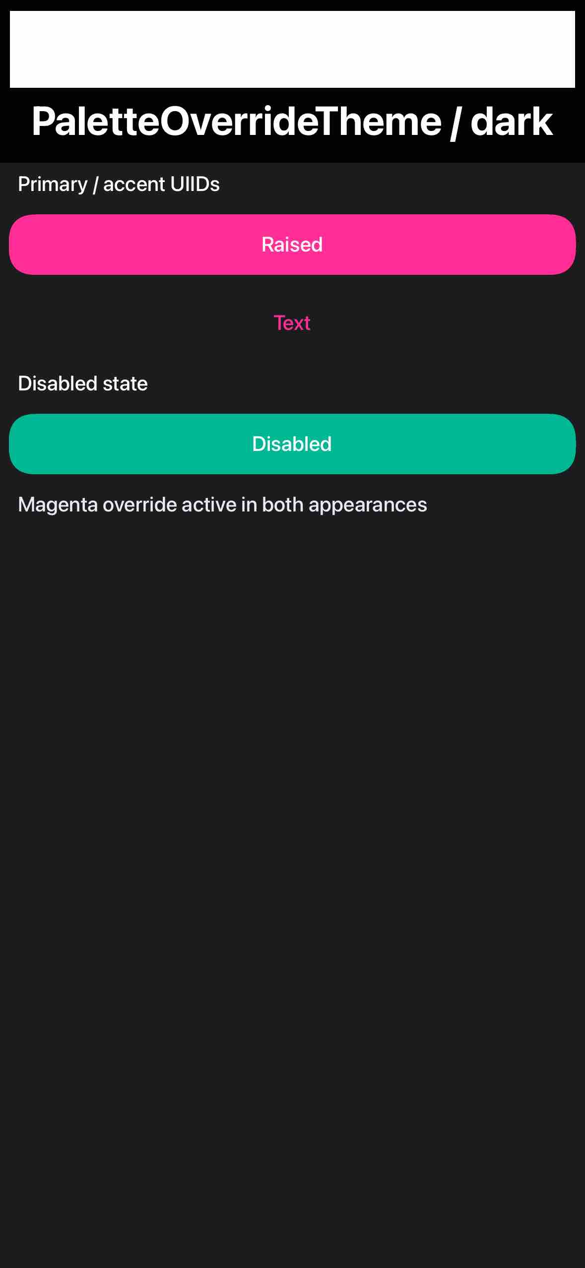
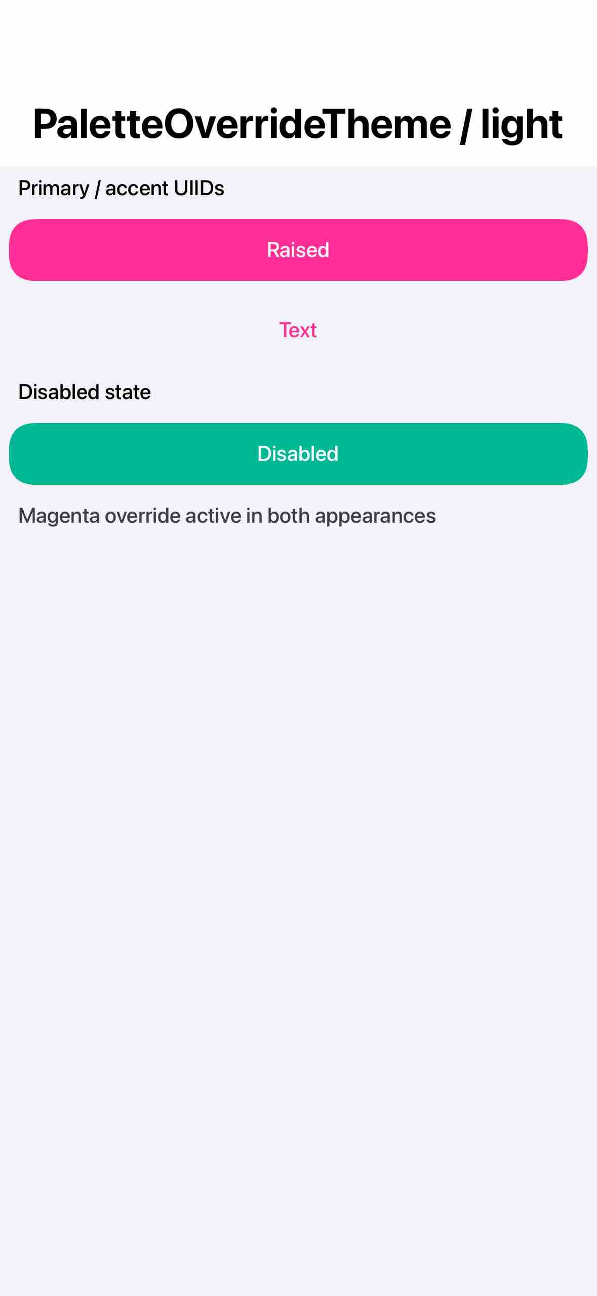
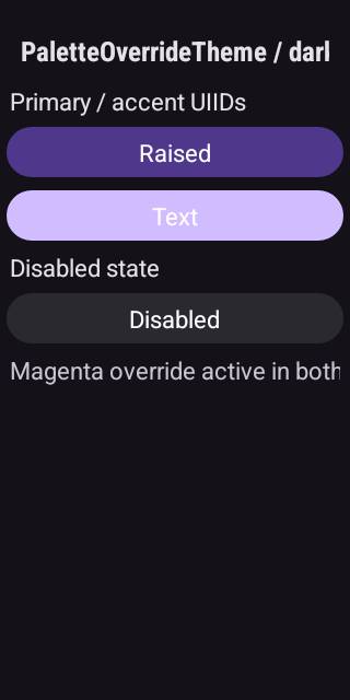
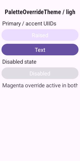
The old per-UIID override and the new @accent-color override happen
to map to the same set of visible widgets on the iOS Modern capture
form (Button.fgColor, RaisedButton.bg/fg) - both produce the same
magenta there, so the iOS pipeline shows zero unmatched screenshots
which masks whether the new binding mechanism actually fires on iOS.

Add a vivid teal override on @accent-disabled-color (iOS-only - the
M3 theme hard-codes its disabled colours and has no binding for this
slot) so the disabled RaisedButton on the form switches from the
default iOS accent-disabled blue to teal. iOS captures now diverge
from the pre-binding baseline, confirming the runtime binding pass
fires on iOS too. Android's diff is already covered by the magenta
@accent-container-color retuning RaisedButton's tonal fill.

Add a sanity log at install time that surfaces any leak from a
previous test in the suite (a stale @accent-color constant). The
test runs near the tail of Cn1ssDeviceRunner and finish() reloads
/theme via initFirstTheme which clears themeConstants - so the
expected pre-state is "no leak". The log is the cheap signal we
need if a future framework regression ever drops that cleanup.

Co-Authored-By: Claude Opus 4.7 (1M context) <noreply@anthropic.com>
Android Material 3's RaisedButton (and other UIIDs using
cn1-pill-border) wraps its fill in a RoundBorder whose color the CSS
compiler bakes in at compile time. By default RoundBorder paints from
that baked field via fillShape() with uiid=false, ignoring
Style.bgColor at render time. The runtime binding pass updates
themeProps[<UIID>.bgColor] correctly when the user pushes an
@accent-color override, but the visible pill stays at the
compile-time fallback because the border, not the Style, owns the
visible color.

When the source background-color came from a var() expansion (i.e.
the binding mechanism wants this fill to be runtime-tunable), flip
the RoundBorder into uiid mode so it routes through
Style.getBgPainter() at paint time. Style.bgColor then drives the
fill, and a runtime @accent-* override propagates all the way to the
visible pixels.

Legacy themes whose backgrounds are inlined hex (no var()) keep the
existing baked-color path, so this is a no-op for everything that
isn't already opted into the binding mechanism.

Update iOS PaletteOverrideTheme_light/dark goldens (both GL and Metal)
to the captures produced by the previously-pushed override-color
expansion - iOS uses border-radius (RoundRectBorder) which already
respects Style.bgColor, so its captures only changed because we
added @accent-disabled-color to the override and the disabled
RaisedButton on the form is now teal instead of accent-disabled
blue. Android goldens will need a fresh CI run with this fix to
capture the now-correct magenta RaisedButton; deferring those.

NativeThemeBindingsTest: extended to cover the AndroidMaterialTheme
.res so the binding round-trip is exercised on both shipped
native-theme palettes.

Co-Authored-By: Claude Opus 4.7 (1M context) <noreply@anthropic.com>
…constants

Lets a user app's theme.css override a native-theme palette variable
purely from CSS:

    #Constants {
        includeNativeBool: true;
        --accent-color: #ff2d95;
        --accent-color-dark: #ff2d95;
    }

Previously `--name` declarations short-circuited into the parser-
internal variables map (used only for compile-time var() resolution
within the same compilation unit) and never reached the runtime, so
a user's --accent-color redeclaration was silently dropped. The
Flute compiler now ALSO emits these as @name theme constants when
they sit inside a #Constants pseudo-element, which routes them
through UIManager.themeConstants where the binding-overlay pass
already knows what to do with them - the user theme.css is loaded
after the native theme (via includeNativeBool=true), the @-constant
overwrites the native default, applyThemeBindings retunes every
bound UIID. Same end-state as runtime addThemeProps but driven from
CSS, no Java code, no Hashtable.

Adds SAC_RGBCOLOR / SAC_FUNCTION (rgb, rgba) handling to the
constants-serialization loop so hex / rgb() colors in #Constants
make it out as plain hex strings (the format runtime themeProps and
applyThemeBindings expect for color values).

Native theme captures still emit their own @accent-color etc. from
their #Constants blocks - this is by design: the constants are
already in themeProps with the native default, so a no-op overlay
runs after each native-theme-load. When the user theme then loads
on top, the user's @accent-color overwrites the native default and
the next applyThemeBindings overlays the user's value.

NativeThemeBindingsTest now also asserts @accent-color is present
in the loaded theme so the round-trip CSS -> .res -> Hashtable is
covered for both shipped native themes.

Native-Themes docs lead with the CSS-from-theme.css path; the
runtime addThemeProps path is documented as the dynamic-theming
counterpart for cases like in-app accent toggles. Test docstring
clarifies it's exercising the runtime path because screenshot
tests can't easily mutate the app's compiled theme.css.

Co-Authored-By: Claude Opus 4.7 (1M context) <noreply@anthropic.com>
1 participant
Summary
var(--accent-color, fallback)syntax in the shipped native theme CSS but additionally emits@cn1-bind:<UIID>.<key>=accent-colorconstants alongside the inlined fallback. The .res ships with every accent-bearing UIID quietly tracking the underlying palette variable.UIManager.buildTheme()gains anapplyThemeBindings()pass that overlays@<varname>constants supplied viaaddThemePropsonto every bound theme key — so a singleaddThemeProps({"@accent-color": "ff2d95", ...})call retunes every UIID at once. Light/dark variants use distinctaccent-color/accent-color-darkconstants; values can be passed as"ff2d95","#FF2D95", or"#f0a"shorthand.#Constantsdeclarations from the reverted Added theme constants for accents #4848 to bothnative-themes/ios-modern/theme.cssandnative-themes/android-material/theme.css. iOS uses 4 vars, Android adds container/on-container/on-color-dark for the M3 token model.docs/developer-guide/Native-Themes.asciidoc) replace the "Forking a theme to rebrand" section with a runtime-override section documenting the@accent-*constant vocabulary per platform.PaletteOverrideThemeScreenshotTestswapped its 12-key per-UIID override for a tighter@-prefixed constant set demonstrating the new path.native-themes/edits so theme.css changes re-run the platform builds.Why this replaces #4848
#4848 also surfaced these constants but did so at CSS-compile time —
var()resolved against the fallback and the native theme had to be forked + recompiled to rebrand. Native themes ship inside the framework build, so forking isn't actually viable for app developers. This PR keeps the same author ergonomics in the CSS source but moves resolution to runtime: the .res carries enough metadata foraddThemePropsto retune every bound UIID without recompiling anything.Test plan
mvn -pl css-compiler installbuilds the CSS compiler with the new binding tracking.scripts/build-native-themes.shregeneratesiOSModernTheme.res/AndroidMaterialTheme.res. Verified@cn1-bind:entries are present in the .res output.mvn -Dtest='*UIManager*,*Theme*,*Style*' test— 46 tests pass.UIManagerThemeBindingsTest(6 tests) covers default fallback, override, hash-prefix and 3-digit shorthand normalization, orphan-binding skip, invalid-color leaving default intact.NativeThemeBindingsTestend-to-end loads the freshly builtiOSModernTheme.resand confirms@accent-colorretunes Button.fgColor.scripts/{ios,android}/screenshots/PaletteOverrideTheme_*.png(and the matchingscreenshots-metal/) will need to be regenerated. The new override touches@accent-container-colortoo, so Android RaisedButton goes magenta where the old test left it at the M3 default tone. iOS captures should be unchanged.🤖 Generated with Claude Code