This repo includes identified Flutter Layouts which anyone can refer as their layout cheat sheet.
A widget that drops all the semantics of its descendants.
Whether this widget is excluded in the semantics tree.
The widget below this widget in the tree. [...]
The hash code for this object. [...]
Controls how one widget replaces another widget in the tree. [...]
A representation of the runtime type of the object.
operator ==(dynamic other) → bool
The equality operator. [...]
A widget that merges the semantics of its descendants
The widget below this widget in the tree. [...]
The hash code for this object. [...]
Controls how one widget replaces another widget in the tree. [...]
A representation of the runtime type of the object.
operator ==(dynamic other) → bool
The equality operator. [...]
A ScrollView that creates custom scroll effects using slivers.
This sample code shows a scroll view that contains a flexible pinned app bar, a grid, and an infinite list.
CustomScrollView(
  slivers: <Widget>[
    const SliverAppBar(
      pinned: true,
      expandedHeight: 250.0,
      flexibleSpace: FlexibleSpaceBar(
        title: Text('Demo'),
      ),
    ),
    SliverGrid(
      gridDelegate: SliverGridDelegateWithMaxCrossAxisExtent(
        maxCrossAxisExtent: 200.0,
        mainAxisSpacing: 10.0,
        crossAxisSpacing: 10.0,
        childAspectRatio: 4.0,
      ),
      delegate: SliverChildBuilderDelegate(
        (BuildContext context, int index) {
          return Container(
            alignment: Alignment.center,
            color: Colors.teal[100 * (index % 9)],
            child: Text('Grid Item $index'),
);A CustomScrollView can allow Talkback/VoiceOver to make announcements to the user when the scroll state changes.
A scrollable, 2D array of widgets. The main axis direction of a grid is the direction in which it scrolls (the scrollDirection).
Transitioning to CustomScrollView
A GridView is basically a CustomScrollView with a single SliverGrid in its CustomScrollView.slivers property.
If GridView is no longer sufficient, for example because the scroll view is to have both a grid and a list, or because the grid is to be combined with a SliverAppBar, etc, it is straight-forward to port code from using GridView to using CustomScrollView directly
Sample
This example demonstrates how to create a GridView with two columns. The children are spaced apart using the crossAxisSpacing and mainAxisSpacing properties.
assignment
GridView.count(
primary: false,
padding: const EdgeInsets.all(20),
crossAxisSpacing: 10,
mainAxisSpacing: 10,
crossAxisCount: 2,
children: <Widget>[
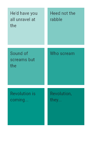
Container(
padding: const EdgeInsets.all(8),
child: const Text('He\'d have you all unravel at the'),
color: Colors.teal[100],
),
Container(
padding: const EdgeInsets.all(8),
child: const Text('Heed not the rabble'),
color: Colors.teal[200],
),
Container(
padding: const EdgeInsets.all(8),
child: const Text('Sound of screams but the'),
color: Colors.teal[300],
),
Container(
padding: const EdgeInsets.all(8),
child: const Text('Who scream'),
color: Colors.teal[400],
),
Container(
padding: const EdgeInsets.all(8),
child: const Text('Revolution is coming...'),
color: Colors.teal[500],
),
Container(
padding: const EdgeInsets.all(8),
child: const Text('Revolution, they...'),
color: Colors.teal[600],
),
],
)Sample
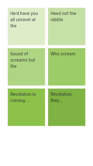
This example shows how to create the same grid as the previous example using a CustomScrollView and a SliverGrid.
CustomScrollView(
  primary: false,
  slivers: <Widget>[
    SliverPadding(
      padding: const EdgeInsets.all(20),
      sliver: SliverGrid.count(
        crossAxisSpacing: 10,
        mainAxisSpacing: 10,
        crossAxisCount: 2,
        children: <Widget>[
          Container(
            padding: const EdgeInsets.all(8),
            child: const Text('He\'d have you all unravel at the'),
            color: Colors.green[100],
          ),
          Container(
            padding: const EdgeInsets.all(8),
            child: const Text('Heed not the rabble'),
            color: Colors.green[200],
          ),
          Container(
            padding: const EdgeInsets.all(8),
            child: const Text('Sound of screams but the'),
color: Colors.green[300],A scrollable list of widgets arranged linearly. Sample
This example uses the default constructor for ListView which takes an explicit List of children. This ListView's children are made up of Containers with Text.
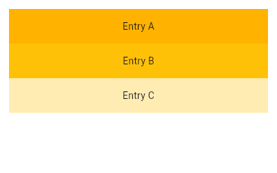
ListView(
  padding: const EdgeInsets.all(8),
  children: <Widget>[
    Container(
      height: 50,
      color: Colors.amber[600],
      child: const Center(child: Text('Entry A')),
    ),
    Container(
      height: 50,
      color: Colors.amber[500],
      child: const Center(child: Text('Entry B')),
    ),
    Container(
      height: 50,
      color: Colors.amber[100],
      child: const Center(child: Text('Entry C')),
    ),
  ],
)